Visualization module
This module contains functions for plotting time series. It can be imported as follows:
>>> from dtaianomaly import visualization
The functions within this module offer alternative manners to nicely plot the time series along with the ground truth or predicted anomalies.
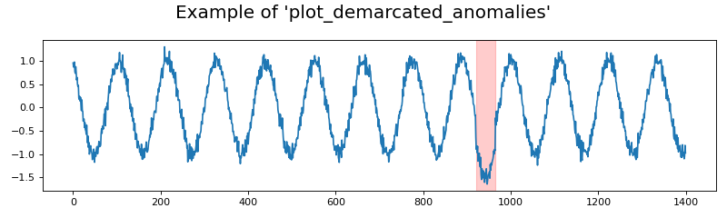
- dtaianomaly.visualization.plot_demarcated_anomalies(X: ndarray, y: array, ax: Axes = None, time_steps: array = None, feature_names: list[str] = None, color_anomaly: str = 'red', alpha_anomaly: float = 0.2, **kwargs) Figure[source]
Plot the time series and demarcate the anomaly.
Plot the given time series and binary anomaly labels. Each anomalous interval is marked by a colored area, depending on the provided parameters.
- Parameters:
- Xnp.ndarray of shape (n_samples, n_attributes)
The time series to plot.
- ynp.array of shape (n_samples)
The binary anomaly scores.
- axplt.Axes, default=None
The axes onto which the plot should be made. If None, then a new figure and axis will be created.
- time_stepsnp.array of shape (n_samples), default=None
The time steps to plot. If no time steps are provided, then the default range
[0, ..., n_samples-1]will be used.- feature_nameslist of str of shape (n_attributes), default=None
The names of each feature in the given time series
X.- color_anomalystr, default=’red’
The color in which the anomaly should be marked.
- alpha_anomalyfloat, default=0.2
The alpha value for marking the anomaly, to adjust transparency.
- **kwargs
Arguments to be passed to plt.Figure(), in case
ax=None.
- Returns:
- plt.Figure
The figure containing the plotted data.
>>> from dtaianomaly.data import demonstration_time_series
>>> from dtaianomaly.visualization import plot_demarcated_anomalies
>>> X, y = demonstration_time_series()
>>> fig = plot_demarcated_anomalies(X, y, figsize=(10, 3))
>>> fig.suptitle("Example of 'plot_demarcated_anomalies'")
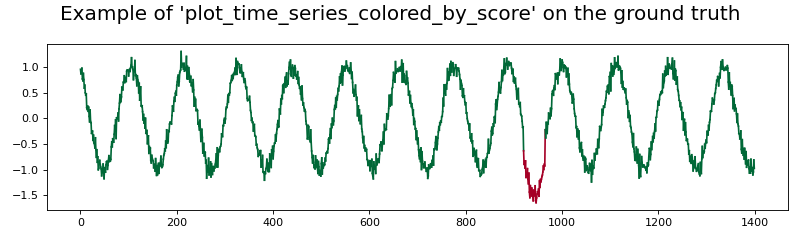
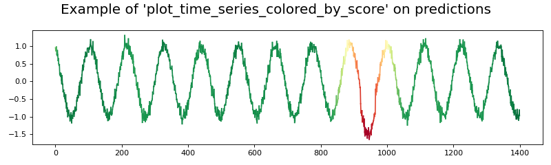
- dtaianomaly.visualization.plot_time_series_colored_by_score(X: ndarray, y: ndarray, time_steps: array = None, feature_names: list[str] = None, ax: Axes = None, nb_colors: int = 100, **kwargs) Figure[source]
Plot the time series colored according to the anomaly scores.
Plot the given time series, and color it according to the given scores. Higher scores will be colored red, and lower scores will be colored green. Thus, if the ground truth anomaly scores are passed, red corresponds to anomalies and green to normal observations.
- Parameters:
- Xnp.ndarray of shape (n_samples, n_attributes)
The time series to plot.
- ynp.ndarray of shape (n_samples)
The scores, according to which the plotted data should be colored.
- time_stepsnp.array of shape (n_samples), default=None
The time steps to plot. If no time steps are provided, then the default range
[0, ..., n_samples-1]will be used.- feature_nameslist of str of shape (n_attributes), default=None
The names of each feature in the given time series
X. Because the color of each attribute varies over time (to indicatey), the labels are not shown for simplicity. The parameter is available for compatability reasons.- axplt.Axes, default=None
The axes onto which the plot should be made. If None, then a new figure and axis will be created.
- nb_colorsint, default=100
The number of colors to use for plotting the time series.
- **kwargs
Arguments to be passed to plt.Figure(), in case
ax=None.
- Returns:
- plt.Figure
The figure containing the plotted data.
Notes
Each segment in the time series will be plotted independently. Thus, for time series with many observations, plotting the data using this method can cost a huge amount of time.
>>> from dtaianomaly.data import demonstration_time_series
>>> from dtaianomaly.visualization import plot_time_series_colored_by_score
>>> X, y = demonstration_time_series()
>>> fig = plot_time_series_colored_by_score(X, y, figsize=(10, 3))
>>> fig.suptitle("Example of 'plot_time_series_colored_by_score' on the ground truth")
>>> from dtaianomaly.data import demonstration_time_series
>>> from dtaianomaly.visualization import plot_time_series_colored_by_score
>>> from dtaianomaly.anomaly_detection import IsolationForest
>>> X, _ = demonstration_time_series()
>>> y_pred = IsolationForest(window_size=100).fit(X).predict_proba(X)
>>> fig = plot_time_series_colored_by_score(X, y_pred, figsize=(10, 3))
>>> fig.suptitle("Example of 'plot_time_series_colored_by_score' on predictions")
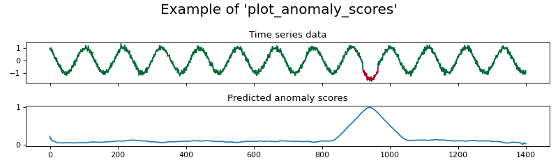
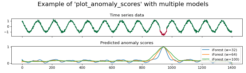
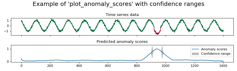
- dtaianomaly.visualization.plot_anomaly_scores(X: ~numpy.array, y: ~numpy.ndarray, y_pred: ~numpy.ndarray | dict[str, ~numpy.ndarray], time_steps: ~numpy.array = None, feature_names: list[str] = None, method_to_plot=<function plot_demarcated_anomalies>, confidence: ~numpy.array = None, **kwargs) Figure[source]
Plot the time series and the predicted anomaly scores.
Plot the given data with the ground truth anomalies, and compare the predicted anomaly scores.
- Parameters:
- Xnp.ndarray of shape (n_samples, n_attributes)
The time series to plot.
- ynp.ndarray of shape (n_samples)
The binary anomaly scores.
- y_prednp.ndarray of shape (n_samples) or dict mapping strings on np.ndarray of shape (n_samples)
The predicted anomaly scores to plot. If an array is given, then only one prediction will be plotted. If a dictionary is given, then all values in the dictionary are predicted anomaly scores, which will all be plotted. In this case, the corresponding key will be added in the legend.
- time_stepsnp.array of shape (n_samples), default=None
The time steps to plot. If no time steps are provided, then the default range
[0, ..., n_samples-1]will be used.- feature_nameslist of str of shape (n_attributes), default=None
The names of each feature in the given time series
X.- method_to_plotcallable, default=:py:autofunc:~dtaianomaly.visualization.plot_demarcated_anomalies
Method used for plotting the data along with the ground truth anomaly scores. Should take as inputs the values
X(the time series data),y(the anomaly labels``),time_steps(the time steps at which there was an observation) andax(the axis on which the plot should be made).- confidencenp.array of shape (n_samples), default=None
The confidence of the anomaly scores. If the predictions
y_predis a dictionary, then the confidence must beNoneto ensure that the figure remains clear.- **kwargs
Arguments to be passed to plt.subplots().
- Returns:
- plt.Figure
The figure containing the plotted data.
>>> from dtaianomaly.data import demonstration_time_series
>>> from dtaianomaly.visualization import plot_anomaly_scores, plot_time_series_colored_by_score
>>> from dtaianomaly.anomaly_detection import IsolationForest
>>> X, y = demonstration_time_series()
>>> y_pred = IsolationForest(window_size=100).fit(X).predict_proba(X)
>>> fig = plot_anomaly_scores(X, y, y_pred, figsize=(10, 3), method_to_plot=plot_time_series_colored_by_score)
>>> fig.suptitle("Example of 'plot_anomaly_scores'")
>>> from dtaianomaly.data import demonstration_time_series
>>> from dtaianomaly.visualization import plot_anomaly_scores, plot_time_series_colored_by_score
>>> from dtaianomaly.anomaly_detection import IsolationForest
>>> X, y = demonstration_time_series()
>>> y_pred = {
...     'iForest (w=32)': IsolationForest(window_size=32).fit(X).predict_proba(X),
...     'iForest (w=64)': IsolationForest(window_size=64).fit(X).predict_proba(X),
...     'iForest (w=100)': IsolationForest(window_size=100).fit(X).predict_proba(X),
... }
>>> fig = plot_anomaly_scores(X, y, y_pred, figsize=(10, 3), method_to_plot=plot_time_series_colored_by_score)
>>> fig.suptitle("Example of 'plot_anomaly_scores' with multiple models")
>>> from dtaianomaly.data import demonstration_time_series
>>> from dtaianomaly.visualization import plot_anomaly_scores, plot_time_series_colored_by_score
>>> from dtaianomaly.anomaly_detection import IsolationForest
>>> X, y = demonstration_time_series()
>>> detector = IsolationForest(window_size=100).fit(X)
>>> y_pred = detector.predict_proba(X)
>>> confidence = detector.predict_confidence(X)
>>> fig = plot_anomaly_scores(X, y, y_pred, confidence=confidence, figsize=(10, 3), method_to_plot=plot_time_series_colored_by_score)
>>> fig.suptitle("Example of 'plot_anomaly_scores' with confidence ranges")
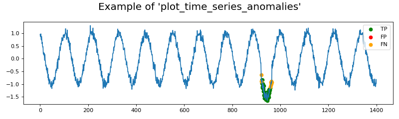
- dtaianomaly.visualization.plot_time_series_anomalies(X: ndarray, y: ndarray, y_pred: ndarray, time_steps: array = None, feature_names: list[str] = None, ax: Axes = None, **kwargs) Figure[source]
Plot the time series along with the TPs, FPs, and FNs.
Visualize time series data with true and predicted anomalies, highlighting true positives (TP), false positives (FP), and false negatives (FN).
- Parameters:
- Xnp.ndarray of shape (n_samples, n_attributes)
The time series to plot.
- ynp.ndarray of shape (n_samples,)
Ground truth anomaly labels (binary values: 0 or 1).
- y_prednp.ndarray of shape (n_samples,)
Predicted anomaly labels (binary values: 0 or 1).
- time_stepsnp.array of shape (n_samples), default=None
The time steps to plot. If no time steps are provided, then the default range
[0, ..., n_samples-1]will be used.- feature_nameslist of str of shape (n_attributes), default=None
The names of each feature in the given time series
X.- axplt.Axes, default=None
The axes onto which the plot should be made. If None, then a new figure and axis will be created.
- **kwargs
Arguments to be passed to plt.Figure(), in case
ax=None.
- Returns:
- plt.Figure
The figure containing the plotted data.
>>> from dtaianomaly.data import demonstration_time_series
>>> from dtaianomaly.visualization import plot_time_series_anomalies
>>> from dtaianomaly.anomaly_detection import IsolationForest
>>> from dtaianomaly.thresholding import FixedCutoffThreshold
>>> X, y = demonstration_time_series()
>>> y_pred = IsolationForest(window_size=100).fit(X).predict_proba(X)
>>> y_pred_binary = FixedCutoffThreshold(cutoff=0.9).threshold(y_pred)
>>> fig = plot_time_series_anomalies(X, y, y_pred_binary, figsize=(10, 3))
>>> fig.suptitle("Example of 'plot_time_series_anomalies'")
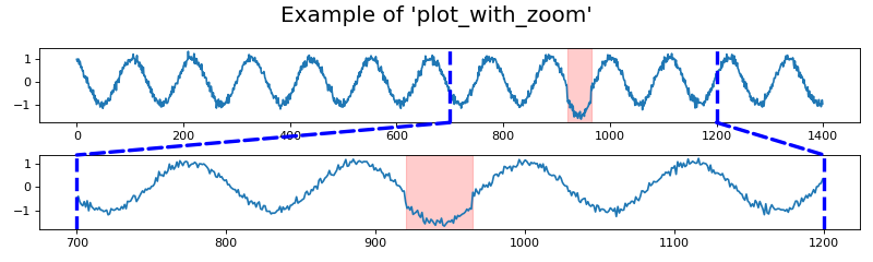
- dtaianomaly.visualization.plot_with_zoom(X: ~numpy.ndarray, start_zoom: int, end_zoom: int, y: ~numpy.array = None, y_pred: ~numpy.array = None, time_steps: ~numpy.array = None, feature_names: list[str] = None, method_to_plot=<function plot_demarcated_anomalies>, color: str = 'blue', linewidth: float = 3, linestyle: str = '--', **kwargs) Figure[source]
Plot the time series and zoom in on it.
Plot the given data in two axes, one showing the entire time series and one zooming in on a specific area of the time series.
- Parameters:
- Xnp.ndarray of shape (n_samples, n_attributes)
The time series to plot.
- start_zoomint
The index in the data at which the zoom starts.
- end_zoomint
The index in the data at which the zoom ends.
- ynp.array of shape (n_samples), default=None
The anomaly ground truth anomaly scores, to be passed to the
method_to_plotfunction.- y_prednp.array of shape (n_samples), default=None
The predicted anomaly scores to plot. Is necessary if the
method_to_plotrequires predicted anomaly scores.- time_stepsnp.array of shape (n_samples), default=None
The time steps to plot. If no time steps are provided, then the default range
[0, ..., n_samples-1]will be used.- feature_nameslist of str of shape (n_attributes), default=None
The names of each feature in the given time series
X.- method_to_plotcallable, default=:py:autofunc:~dtaianomaly.visualization.plot_demarcated_anomalies
Method used for plotting the data. Should take as inputs the values
X(the time series data),y(the anomaly labels``),time_steps(the time steps at which there was an observation) andax(the axis on which the plot should be made). Optionally, the method takes as input a valuey_predfor the predicted anomaly scores.- colorstr, default=’blue’
The color of the lines to demarcate the area of zooming.
- linewidthfloat, default=3
The width of the lines to demarcate the area of zooming.
- linestylestr, default=’–’
The style of the lines to demarcate the area of zooming.
- **kwargs
Arguments to be passed to plt.subplots().
- Returns:
- plt.Figure
The figure containing the plotted data.
>>> from dtaianomaly.data import demonstration_time_series
>>> from dtaianomaly.visualization import plot_with_zoom
>>> X, y = demonstration_time_series()
>>> fig = plot_with_zoom(X, y=y, start_zoom=700, end_zoom=1200, figsize=(10, 3))
>>> fig.suptitle("Example of 'plot_with_zoom'")